Bupa Health Information
UX Strategy

Overview
I created an experience strategy and led the redesign on how health information is organised and presented to customers on the Bupa website.
The problem
Bupa works in siloed business units that all create health content across the site. This lack of strategic approach to content led to a cluttered website, with a lot of duplication and no clear customer journeys.
The challenge
We needed to take a holistic view of health content across all business units and reimagine how it’s presented, to align with the customer goals, the journey they take and their mental models.
My approach
I was leading the squad, providing strategic and design direction and championing new ways of working.
I built relationship with stakeholders, understood and translated requirements and ensured the team remained on track throughout the project.
Discovery
I created a plan that started with business and user discovery, including:
- Stakeholder interviews & workshops
- Journey mapping
- Data analysis
- Competitor reviews
- Content & design workshops
- Campaign evaluation
- User research
- Card sorting & tree testing
Experience strategy
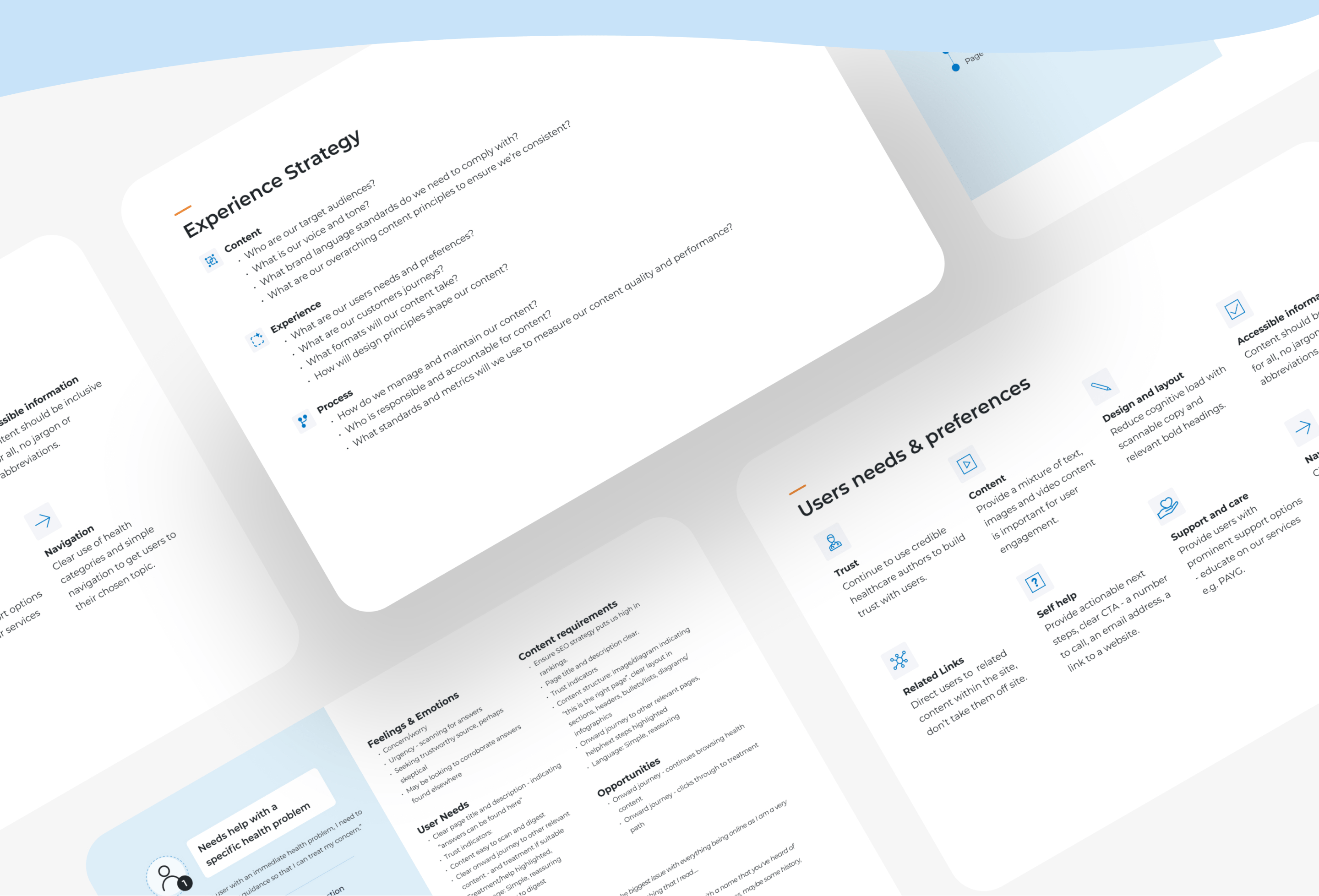
I created an experience strategy which defined our approach, including:
- Overall project vision
- Business and user goals
- Breakdown of our core audience with proto-personas and content principles
- Design and process principles that we would follow
Design
During the design phase I ran:
- Ideation workshops with the design squad
- Collaborative design sessions
- Content flow mapping
- Multiple peer and stakeholder reviews
- Summative user research to test our proposed designs

The results
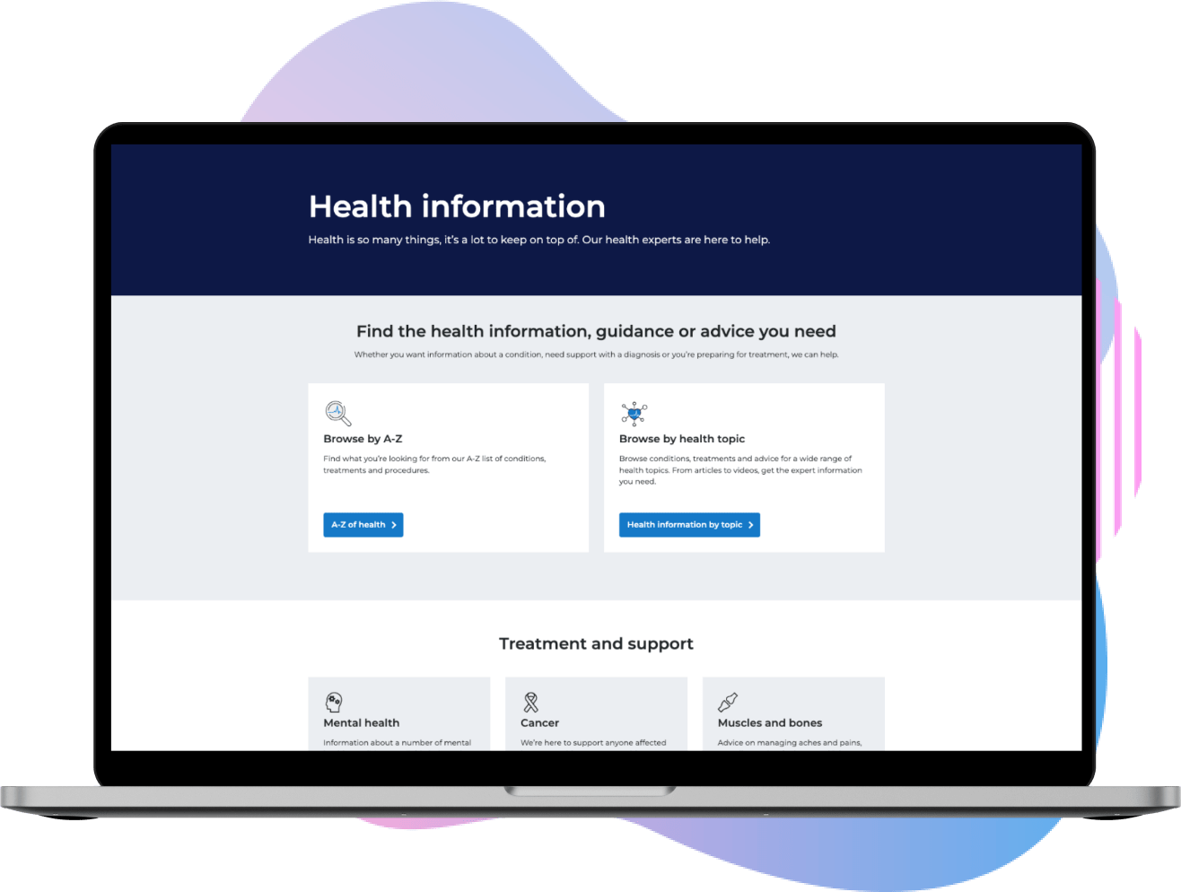
The work consisted of a complete redesign and restructure of our health content into an area called Health Information, which gave clear paths for our different user types, whether it’s someone with an immediate health concern or someone looking to live a healthier lifestyle.

What we observed
Increased traffic to our Health Information landing page and A-Z health concerns landing page, meaning users were being funnelled as we designed it through the navigational options
Significant uplift to our Health topic pages – the top 5 being mental health 37%, muscles, bones & joints 36%, children’s health 18%, knee pain 12% & surgeries & procedures 13%
Significantly reduced bounce rate overall, especially on the knee pain topic landing page, from 50% down to 18%
People spend longer on the health topics pages (showing they were engaging with the content) and we saw a 27% uplift in views to the video content
Through our scroll-map analysis, we could see people were able to access more of the relevant content on the page, with 75% reaching all health conditions
Let’s connect 👋🏻
Email me: hello@heidisnape.com
SEE NEXT: